

Bite Back 2030 needed an in-your-face, eye-catching brand identity to market their Youth Leadership Programme to teens. I developed 3 initial moodboards for the Bite Back team, titled “Revolución”, “Moving Forward” and “Pop”.
The goal of the moodboards was to express what I felt would work with their target market (London-based 11-19 year-olds), while also providing a range of options that Bite Back could look to and really refine what their vision was. In the end, I blended the two favourites, “Pop” and “Revolución” and presented two design routes that went to the Bite Back Youth Board for their feedback and input.
The end result is a brand identity based on collaboration throughout the design process, creating a final product that connects with Bite Back’s target market.

In addition to the logo, I created a brand identity guidebook, web banners, and social media assets to advertise the opening of the Youth Leadership Programme for 2020/2021


Working process


Moodboards created to explore different directions and tones of voice for the leadership programme. A lot of inspiration was taken from the revolutionary spirit of Extinction Rebellion, as well as flyers and activist graffiti found in Brick Lane.


First expressions of a design aesthetic and iconography using what was named “Route 1”, and which I affectionately called Revolución.


Logo exploration using the existing Bite Back colour palette, which was developed from the “Pop” route.
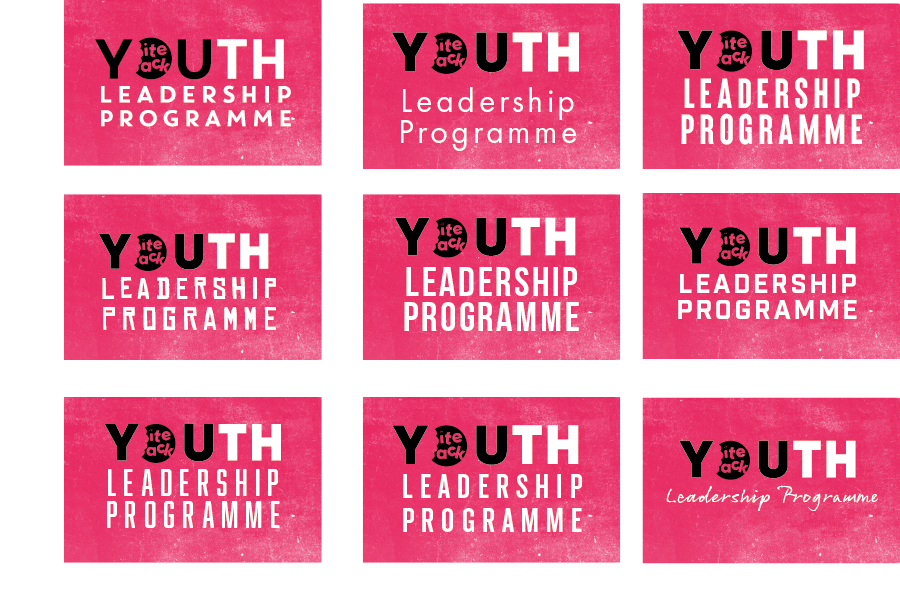


Font pairing tests after refining the look and feel of the visual identity, a hybrid between “Pop” and “Revolución”.